SOCA OUTDOOR FESTIVAL
REDESIGN - VISUAL IDENTITY
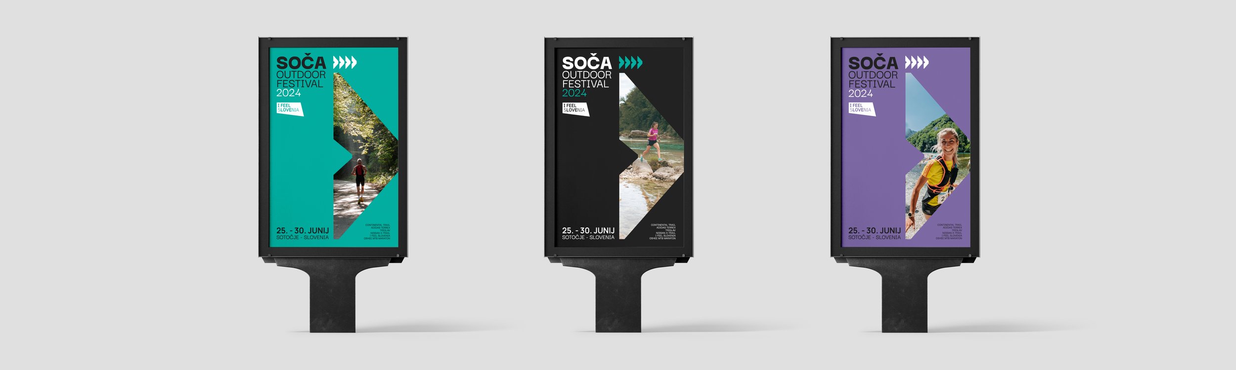
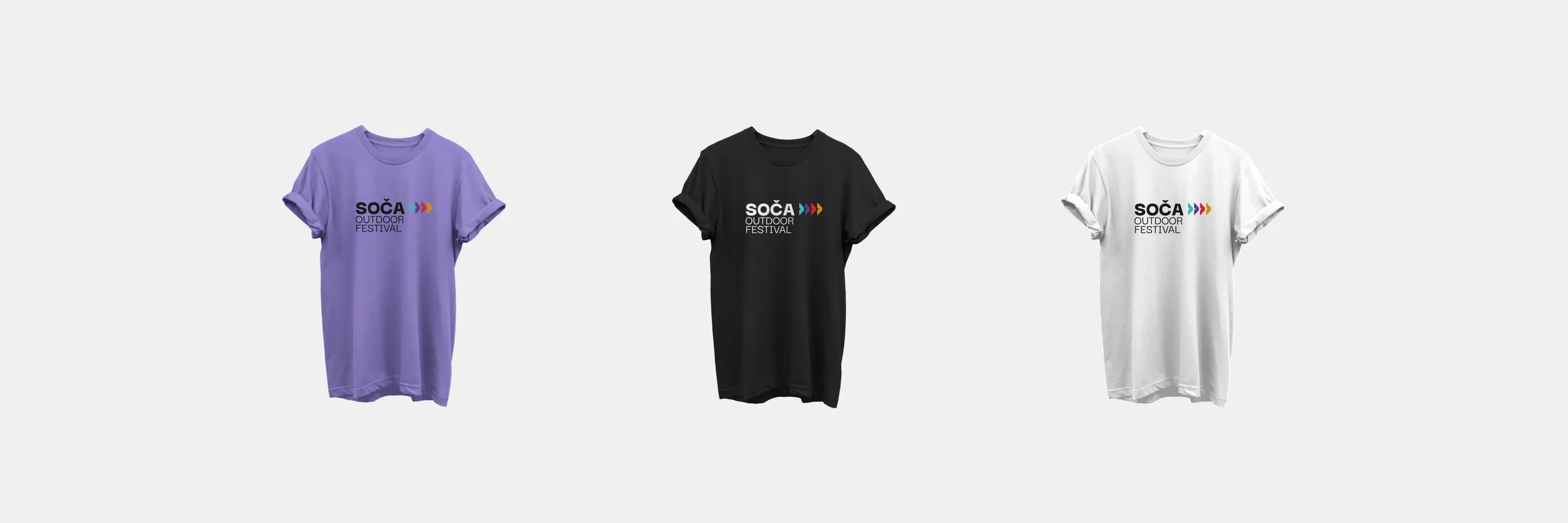
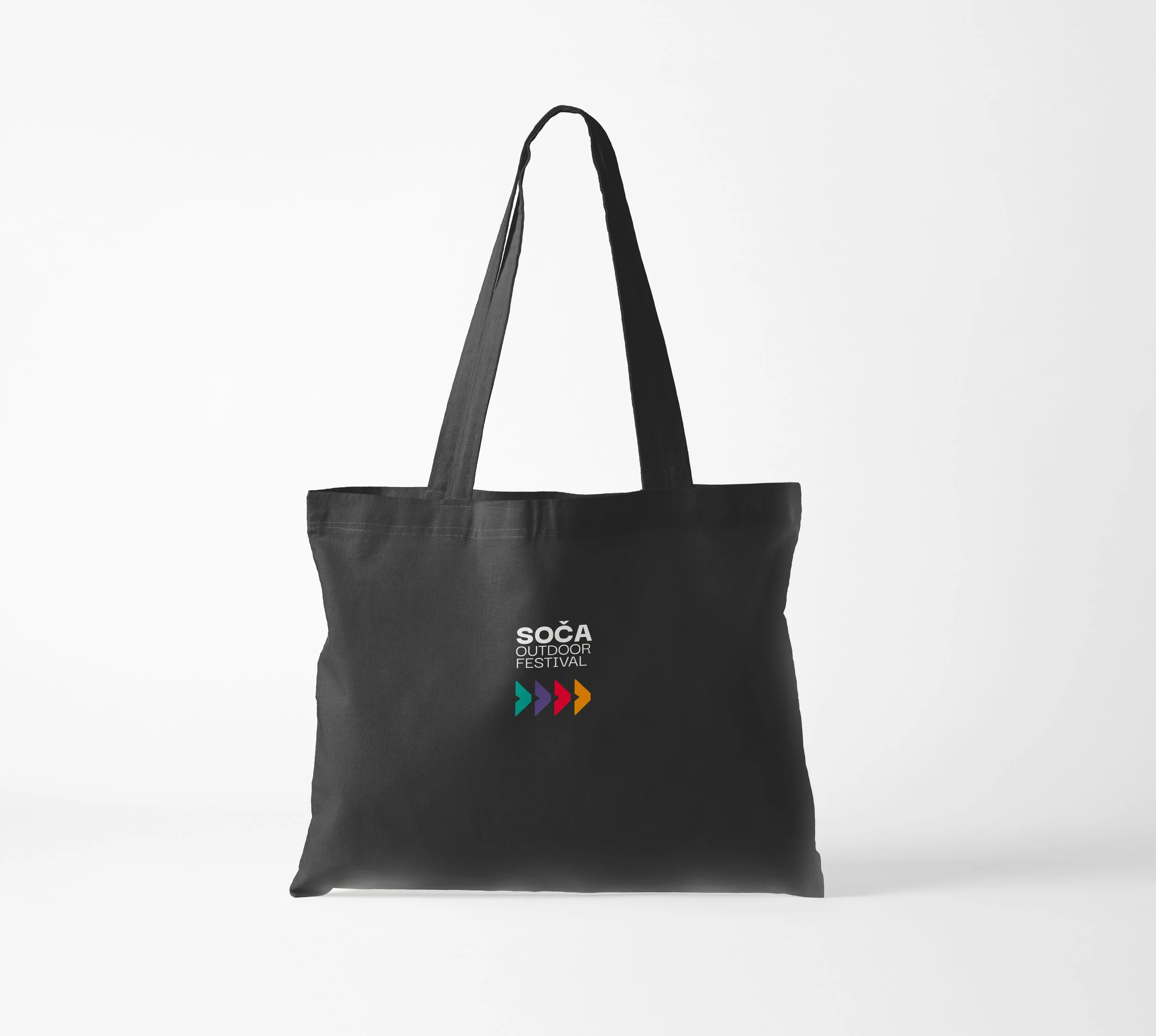
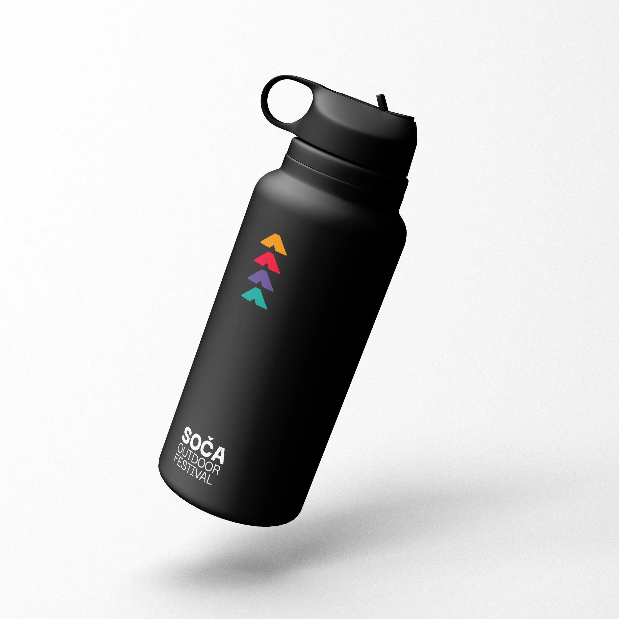
When I started with the redesign of the Soča Outdoor Festival, my objective was to enhance its appeal while preserving its positive elements. Given the festival's focus on sports, I strived to create a design that could adapt to diverse scenarios. While maintaining the typographic core, I opted for a simpler approach, discarding unnecessary embellishments such as intricate textures.A notable addition to the revamped design was the incorporation of four arrows. Beyond their visual impact, these arrows symbolize different directions, representing the varied challenges inherent in the festival—ranging from short to lengthy and ultra-long distances. The design, with its playfulness reminiscent of short runs and the seriousness associated with longer distances, encapsulates the dynamic spectrum of experiences within the festival in a unified and engaging visual expression.